SituationalAwareness Map
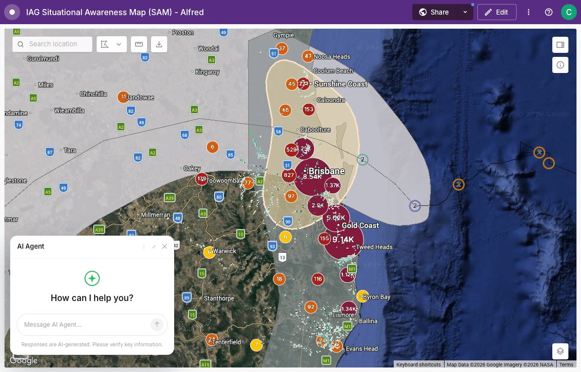
One live map connecting active natural perils with insurance exposure — so IAG can see who's affected, protect customers, and deploy the right people and support where they're needed most.
About the Project
During major events, operational teams need to make fast decisions — but the information they need is scattered across weather, hazard, property and policy data. Building a clear picture of what's happening, who's affected, and where resources are needed most takes critical time they don't have.
The Situational Awareness Map closes that gap — bringing live peril data and insurance exposure into one shared view, so teams can understand impact, protect customers and coordinate the response faster.
From hazardto exposure
Live feeds from fire and weather agencies are joined, in space and time, to the portfolio — turning "Where is the fire?" into "Who is affected — and how much exposure is inside the footprint right now?"
What took hours of manual GIS work now updates continuously, on its own.
Built for thecommand center
Designed as a calm, dark command dashboard — dense with signal, easy to read under pressure.
Live event feed
Bushfire, flood, storm, hail and cyclone feeds — toggle on and off, colour-coded by type.
Exposure overlay
Policy and dollar exposure rendered spatially, so concentration is visible at a glance.
Footprint analytics
Spatial joins count policies and exposure inside each hazard footprint in real time.
Portfolio concentration
See where risk clusters across the portfolio before, during and after an event.
Understandingthe response
Before building the map, I worked with claims and operational teams to understand how decisions are made during a major event — what they need to know, where the information comes from, and what slows the response down.
What's happening?
Where is the event moving? How severe is it, and which areas are in its path?
Who's affected?
Which customers and properties are exposed? How much of the portfolio is inside the footprint?
What do we do next?
Who needs to be alerted, and where should people and support be deployed?
When itbecame real
260108 · VIC Longwood Bushfire
During the Longwood Bushfire, the map brought together live government fire data with IAG's property exposure to identify properties potentially in the affected area.
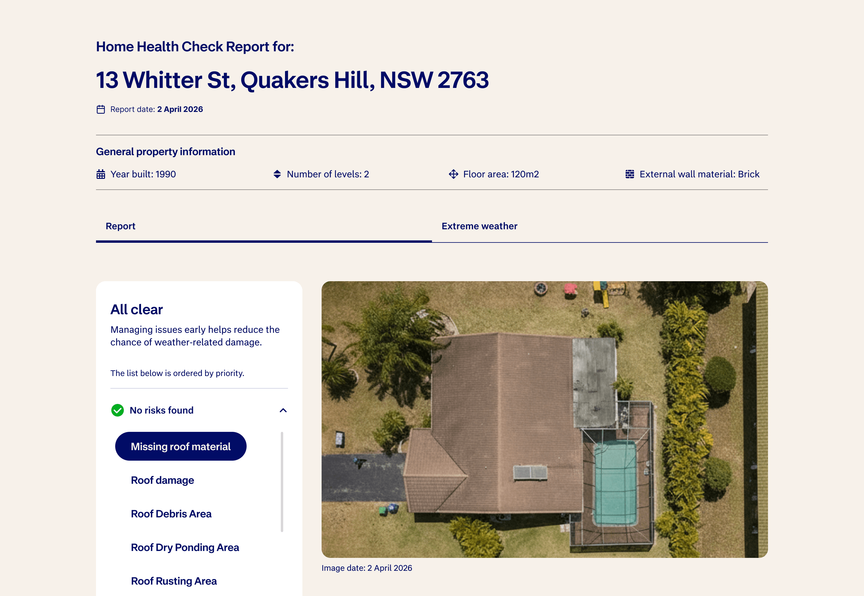
As the event developed, we went beyond the fire footprint — bringing in post-event aerial imagery from a third-party provider to assess visible property damage, reviewing around 2,000 potentially affected properties and supporting the analysis of around 900 claims.
This gave response and claims teams a faster, shared picture of where the fire was, which properties may have been damaged, and where attention was needed most.
My Role
I worked across the full journey — understanding how operational teams make decisions during major events, shaping the product around those needs, and building the geospatial capability that brought it to life.
That meant working across users, hazard data, spatial modelling, policy exposure and the map experience — turning a complex operational problem into a tool teams could actually use under pressure.
Hazard Feeds
Live peril data from NSW RFS, BoM and other government sources, ingested continuously.
Ingestion & Processing
Python pipeline cleans, normalises and spatially joins hazard data in the cloud.
Policy Exposure
Spatial join against IAG's full policy and claims portfolio to calculate exposure inside each footprint.
CARTO Map
Interactive, map-first dashboard served to response, claims and customer teams.